Space between lines
-
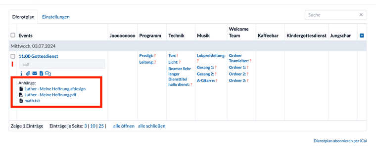
I often click on the wrong link (date instead of accepting a task, or the song docx instead of PDF) because they're too close vertically, and I can't even zoom with 2 fingers. I suggest that when running in the web interface to make the space between lines a bit more "thumb friendly".
Thanks
-
Hey @Raphael-Catossi,
I don't know excatly what you mean. Do you have a screenshot to show where you want more space?
-
@Aqsa-Bibi
Do you mean the Files list in the Events List?